Understanding Atmospheric Perspective
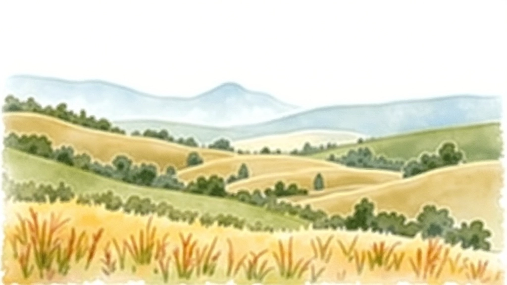
Atmospheric depth isn't about drawing smaller objects further away—though that helps. It's about how air between the viewer and distant objects affects what we see. In reality, moisture, dust, and particles in the atmosphere scatter light. This means distant mountains appear lighter, less saturated, and shift toward blue tones. You've probably noticed this yourself: a hill 5 kilometres away looks hazy and blue compared to a tree right in front of you.
The key insight is this: foreground colours are warm, dark, and saturated. Middle-ground colours cool down and lighten. Background colours become cool, pale, and soft. This isn't optional—it's how our eyes actually see the world. When you paint without these shifts, your landscape looks flat. It's not because you're a bad painter. It's because you're missing the atmospheric rule that creates depth.
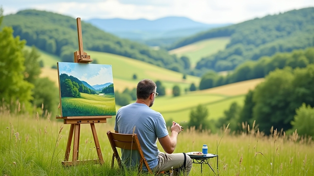
Start noticing this in real life. Look at a landscape on a clear day. The grass near you has rich greens. Trees in the middle distance are duller. Mountains at the horizon look almost blue-grey. That's atmospheric perspective in action. We'll use this observation to build depth into every painting.
Warm Versus Cool: The Temperature Shift
Colour temperature is your most powerful tool for creating depth. Warm colours (yellows, oranges, reds) come forward. Cool colours (blues, purples, cool greens) recede. This isn't a suggestion—it's how human vision works. Your brain automatically interprets warm as closer and cool as further away.
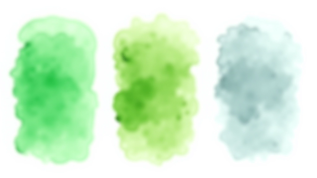
In your foreground, use warm greens. Mix ultramarine blue with cadmium yellow—not lemon yellow. You'll get a warm, rich green that sits forward on the page. For middle-distance foliage, shift toward yellow ochre mixed with ultramarine. This cools it down and pushes it back. By the time you reach the treeline at the horizon, you're using cerulean blue with just a touch of raw sienna. The result feels distant without any effort.
The temperature shift also works with greys. A warm grey in the foreground (grey mixed from ultramarine and burnt sienna) feels closer than a cool grey in the background (grey from cerulean and alizarin). Same lightness value, completely different spatial effect. This technique alone transforms flat paintings into ones that breathe.
Saturation: From Vivid to Subtle
Saturation control might seem obvious, but it's where most beginners stumble. Foreground colours should be pure and saturated—straight from the tube mixed with minimal water. Your nearest trees, rocks, and grass demand attention. They're vivid because that's what our eyes see up close.
Middle-distance elements need to be noticeably duller. Don't just lighten them—desaturate them. This means adding a complementary colour to reduce vibrancy. If you've painted a green tree in the middle distance, add a tiny amount of red or magenta to the mix. It won't look red. It'll look like a natural, muted green. It'll also sit further back in your composition than the saturated greens in front.
Background elements are almost monochromatic. The distant hill isn't a pure blue or purple—it's a pale, greyish-blue that's barely there. You're using less pigment, more water, and often adding grey to reduce intensity. By the horizon, your colours are so soft they're almost whispers. This restraint is what creates the sense of vast distance.
Remember
Individual learning outcomes vary from person to person. These techniques are guidelines based on how atmospheric perspective works in nature. Your own paintings might need adjustment based on lighting conditions, the specific landscape you're painting, and your personal artistic choices. Experiment and see what works for your style.
Practical Painting Process
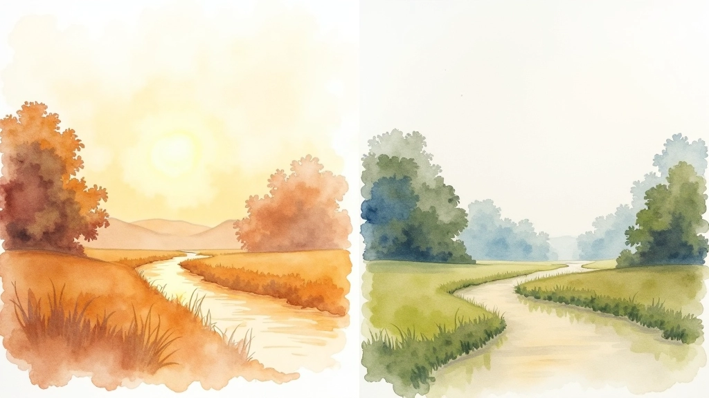
Let's walk through how this works in an actual painting. Start with your sky. The sky establishes the overall colour temperature for the entire piece. If you want warm sunlight, use warm greys and pale yellows. If you want cool light, use pale purples and cool greys. Don't overthink it—this is the foundation.
1
Block in the horizon line
Keep it simple. Pale colour, minimal detail. This is your background anchor.
2
Add middle-distance shapes
Trees, hills, or water. Keep them cool and desaturated. No fine detail here—just shapes that recede.
3
Build foreground with warm, saturated colour
This is where you add detail, texture, and visual weight. Rich greens, warm shadows, defined edges. This layer brings everything forward.
That's it. Three layers with clear temperature and saturation shifts. When you follow this structure, depth happens automatically. You're not fighting the natural laws of vision—you're working with them.
Common Mistakes and How to Fix Them
The biggest mistake is using the same colour temperature throughout. If your entire painting is warm, nothing recedes. If it's all cool, there's no foreground. Your eye doesn't know where to focus. The fix is simple: commit to the shift. Make your foreground noticeably warmer than your background. It'll feel exaggerated at first. It won't be.
The second mistake is forgetting about edges. Foreground objects have sharp, defined edges. Background objects have soft, blurred edges. This isn't just about atmospheric moisture—it's about how our eyes focus. When you paint with sharp edges throughout, the painting looks photographic and flat. Soften your distant edges. You'll see depth appear immediately.
The third mistake is overworking the background. The urge to add detail everywhere is strong, but it destroys depth. Your background should look almost unfinished. Pale, simple, suggestive rather than literal. This restraint is what makes distance read clearly.
Why This Works Every Time
These aren't arbitrary rules. They're based on how light, air, and human vision actually work. When you paint with atmospheric perspective, you're not creating an illusion—you're recreating what your eyes naturally see. The brain recognises it instantly because it's how the world looks.
Start with just one principle. Pick temperature or saturation and focus on that in your next painting. You'll see immediate improvement. Then add the second principle. Then the third. Within a few paintings, it'll become automatic. You won't have to think about it anymore. Your hand will reach for the cool blue without hesitation because it knows where things belong in space.
The result is paintings that feel alive and three-dimensional. Paintings where you can almost walk into the distance. That's the power of atmospheric depth—and it's entirely within your control.