

Starting Your First Watercolour Landscape
Everything beginners need to know before picking up a brush. We cover paper type, pigment selection, and the tools that actually matter.
The biggest mistake beginners make with landscape greens. Learn the three-pigment method that produces natural, luminous greens every time.
Author
Editorial Team
Written by the trenpine editorial team, focused on practical, honest guidance for watercolour landscape painting.
You've probably been there. You mix what should be a fresh spring green, and it comes out looking like mud. It's frustrating because you know exactly what colour you're trying to paint — you can see it in the landscape right in front of you.
The problem isn't your eyes or your technique. It's that most beginners use two pigments when they really need three. They grab a blue and a yellow, mix them together, and wonder why the result looks dead. What they don't realise is that a single blue and a single yellow are fighting each other — the blue's pulling cool, the yellow's pulling warm, and you end up with something muddy in between.
There's a better way. It's not complicated, and once you understand it, you'll never paint a dull green again.
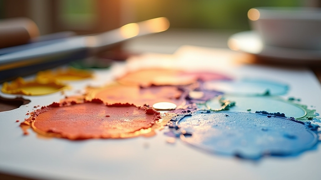
Here's the secret: natural greens are made from three pigments working together, not two fighting it out. You need a warm blue, a cool blue, and a yellow. That gives you control.
Start with ultramarine blue as your warm blue. It leans slightly towards purple, which sounds odd, but it's exactly what you need. Then add cerulean blue as your cool blue — this one leans towards green already. Finally, use either cadmium yellow light or lemon yellow depending on whether you want warmth or brightness.
Don't worry about having perfect pigments. The idea is that you've got options. When you want a warmer green, you'll use ultramarine plus cadmium yellow. When you want something cooler and brighter, cerulean plus lemon yellow gets you there. And here's the thing — you can mix all three together and still get something natural-looking because they're balanced.
Key Principle: Three pigments give you control. Two pigments fight each other.

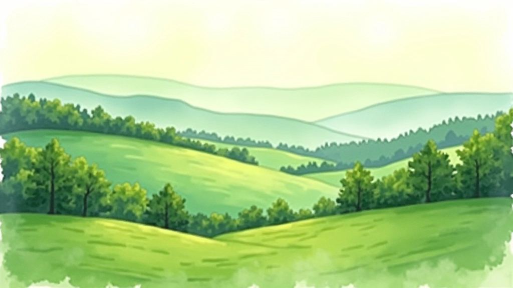
Once you've got your three pigments sorted, the real skill is using temperature to build depth. This is where your painting starts to look professional instead of flat.
Foreground greens should be warmer and darker. Use ultramarine blue with cadmium yellow and maybe add a tiny touch of burnt sienna to knock back the brightness. The green sits forward because it's warm and dark. In the middle distance, start cooling things down. Bring in more cerulean, less cadmium. The greens get lighter naturally as they recede.
Background trees? Those should be almost cool-grey-green. Lots of cerulean, less pigment overall, maybe a touch of alizarin crimson to neutralise the green slightly. The key is that you're not changing the pigments much — you're changing the ratios and the values. Dark warm in front, light cool in back. That's how landscapes breathe.
Mud happens when you've got too many pigments fighting in the mix. You'll start with a nice green, then think "it needs more blue," add blue, then think "it needs more yellow," add yellow, and suddenly you've got a brownish-grey mess.
The solution is restraint. Mix your green. If it doesn't feel right, don't adjust it by adding more. Instead, start fresh on a clean spot of your palette. This takes discipline, but it's the difference between a landscape that glows and one that looks tired.
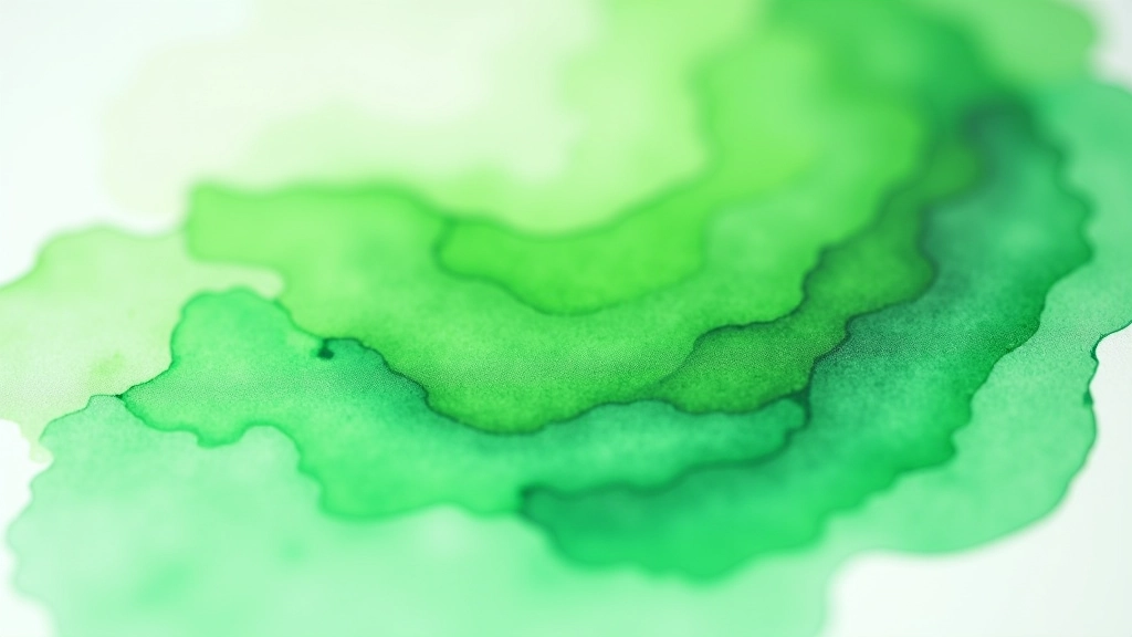
Another muddy-green killer: don't mix your greens to full saturation. A green that's too bright looks artificial anyway. Keep it slightly muted — that's what real foliage actually looks like. A touch of red (alizarin or permanent rose) or a hint of the complementary colour takes that synthetic edge off without killing the vibrancy.
Learning Note: Individual learning outcomes vary from person to person. Your results will depend on your specific pigments, water quality, paper type, and practice. These guidelines are starting points — experiment and find what works for your style.
You don't need special pigments or fancy equipment to mix beautiful greens. You need understanding. The three-pigment approach isn't a rule you'll follow forever — it's a framework that teaches you how colours actually work. Once you've done this a few times, you'll develop an intuition for it. You'll look at a landscape and instantly know whether you need warmth or coolness in your green, and you'll know which pigments to reach for.
Start with a simple landscape study. Focus just on the greens. Mix your ultramarine, cerulean, and cadmium yellow. Practise the warm-dark-foreground, cool-light-background approach. Don't overthink it. After three or four studies, you'll feel the difference between a dead green and a living one. That's when landscape painting becomes less frustrating and more rewarding.
The greens in your paintings should feel like they belong in the landscape. They should have depth, temperature, and life. With these three pigments and the understanding of how to use them, you'll paint landscapes that people want to look at.
Everything beginners need to know before picking up a brush. We cover paper type, pigment selection, and the tools that actually matter.
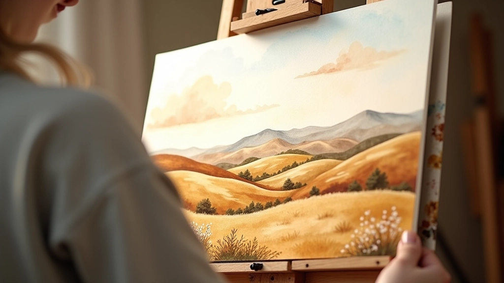
How to use colour temperature and saturation to create the illusion of distance. Make your landscapes feel spacious and real.
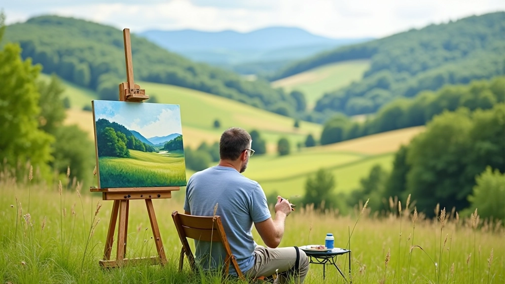
A practical guide to working outdoors in the Moravian landscape. We cover portable supplies, quick sketching techniques, and capturing natural light.